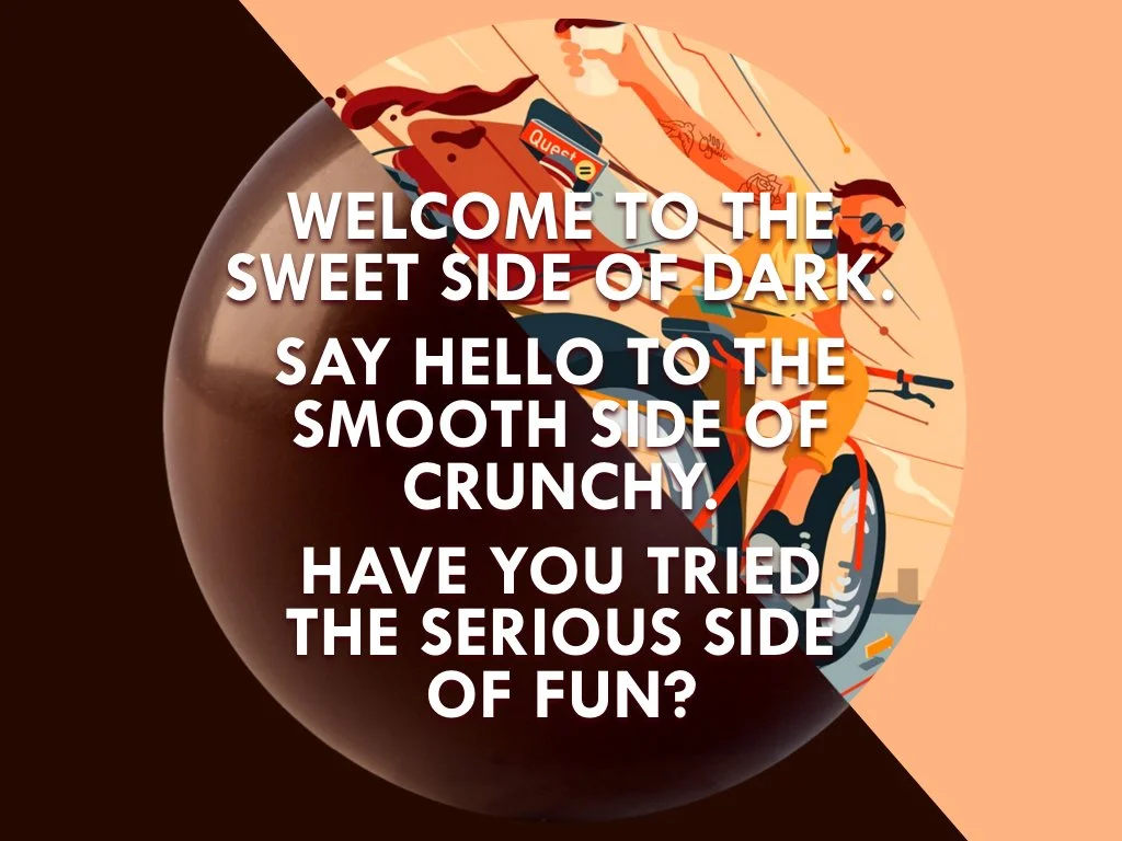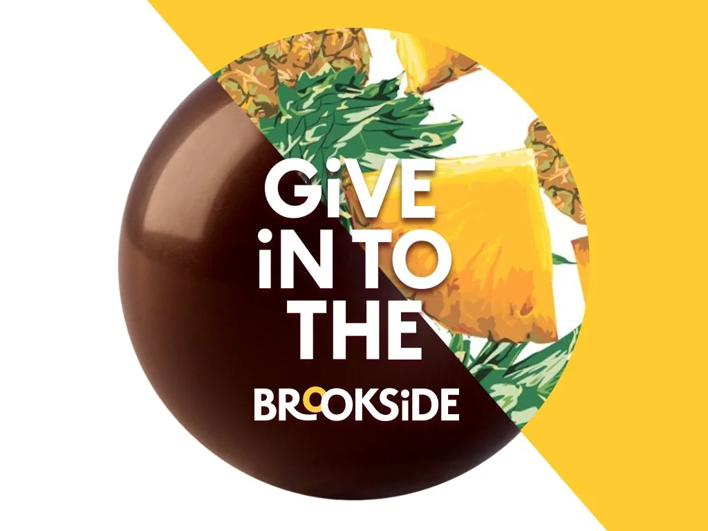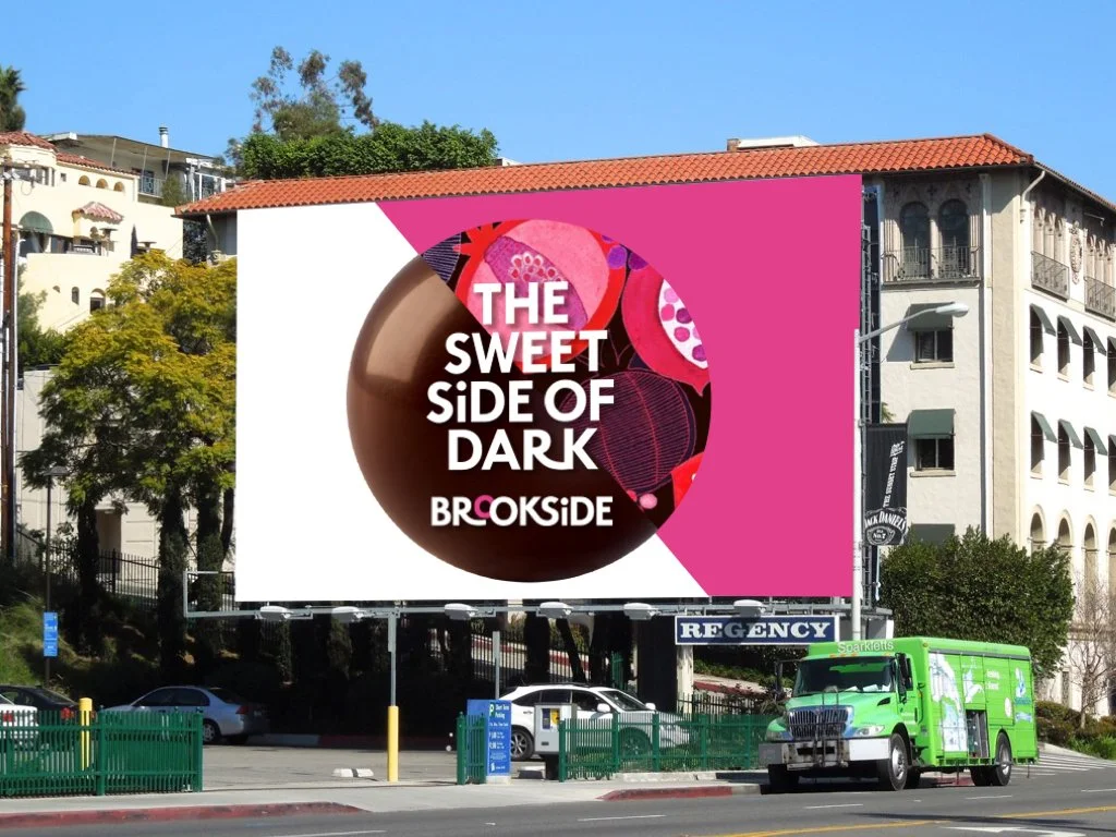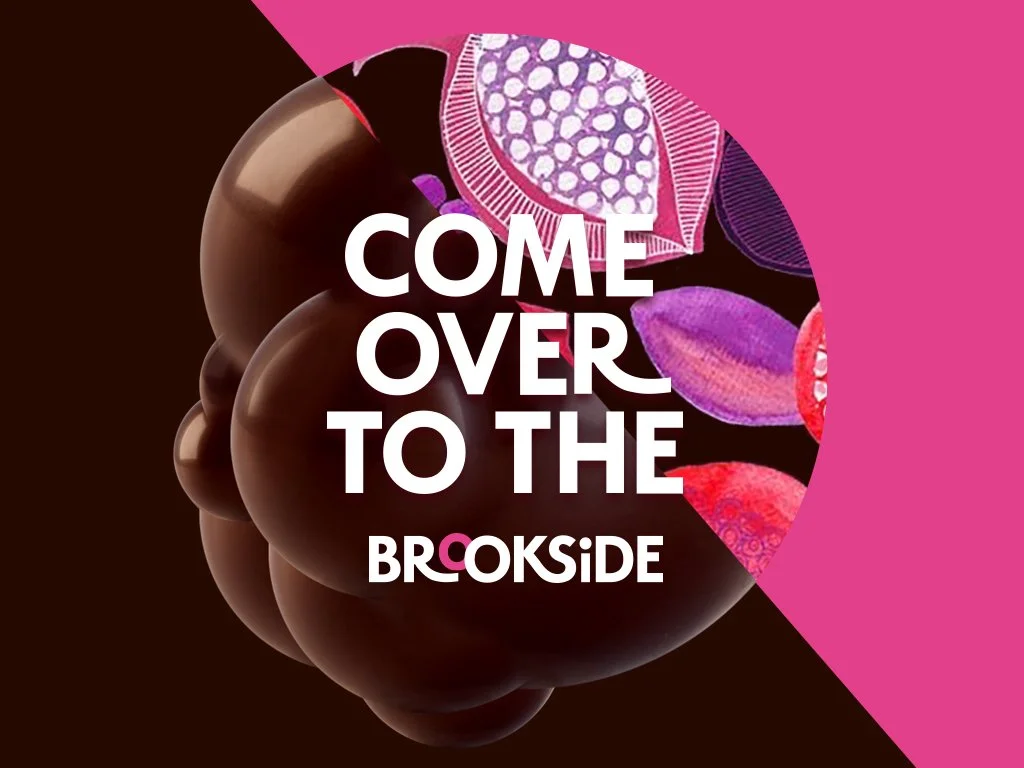
Meet the sweet side of dark.
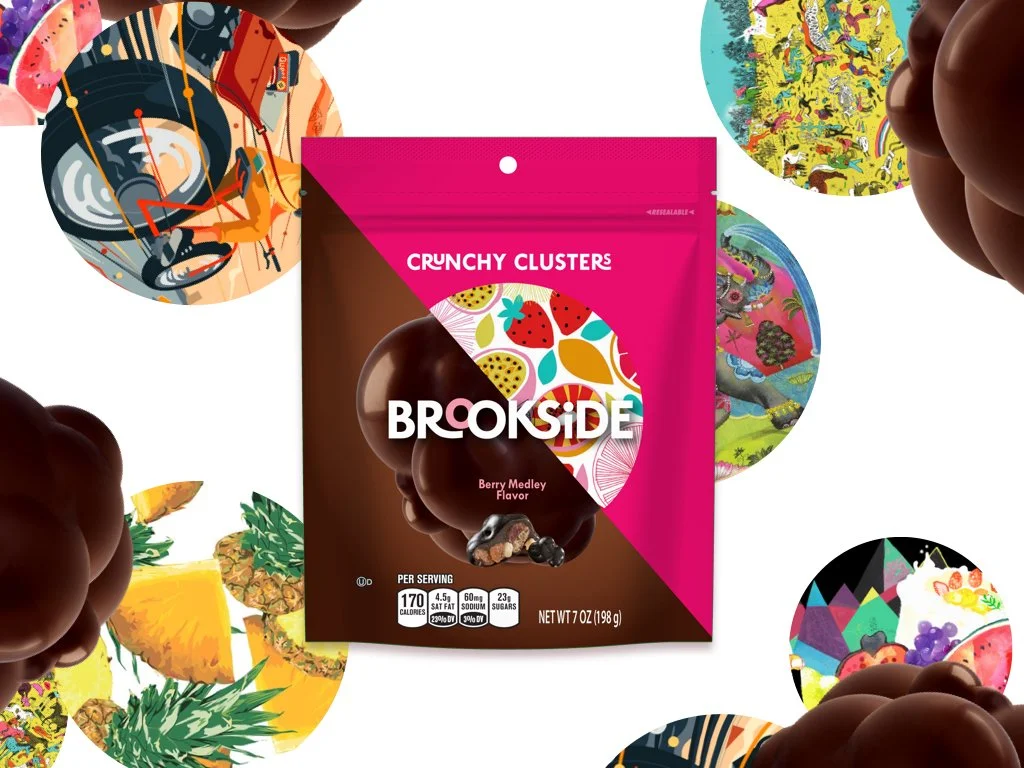
Brookside and goDutch rethought the brand from scratch. The question on the table: what makes Brookside emotionally distinct on a crowded shelf, and how can packaging say it at a glance?
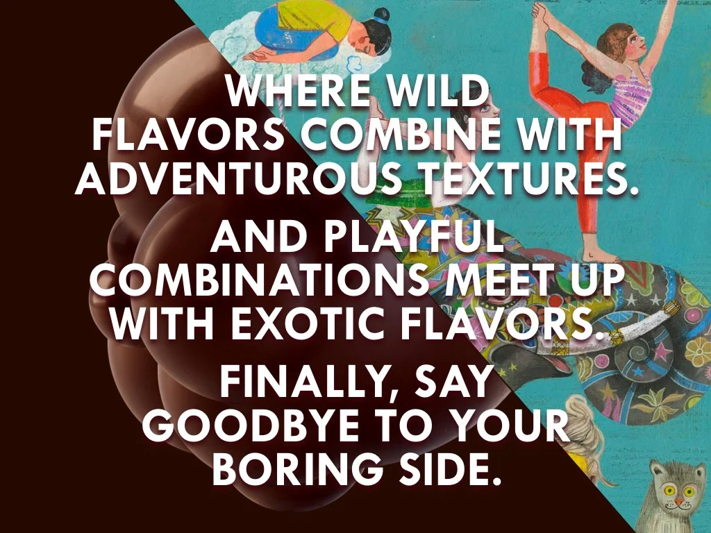
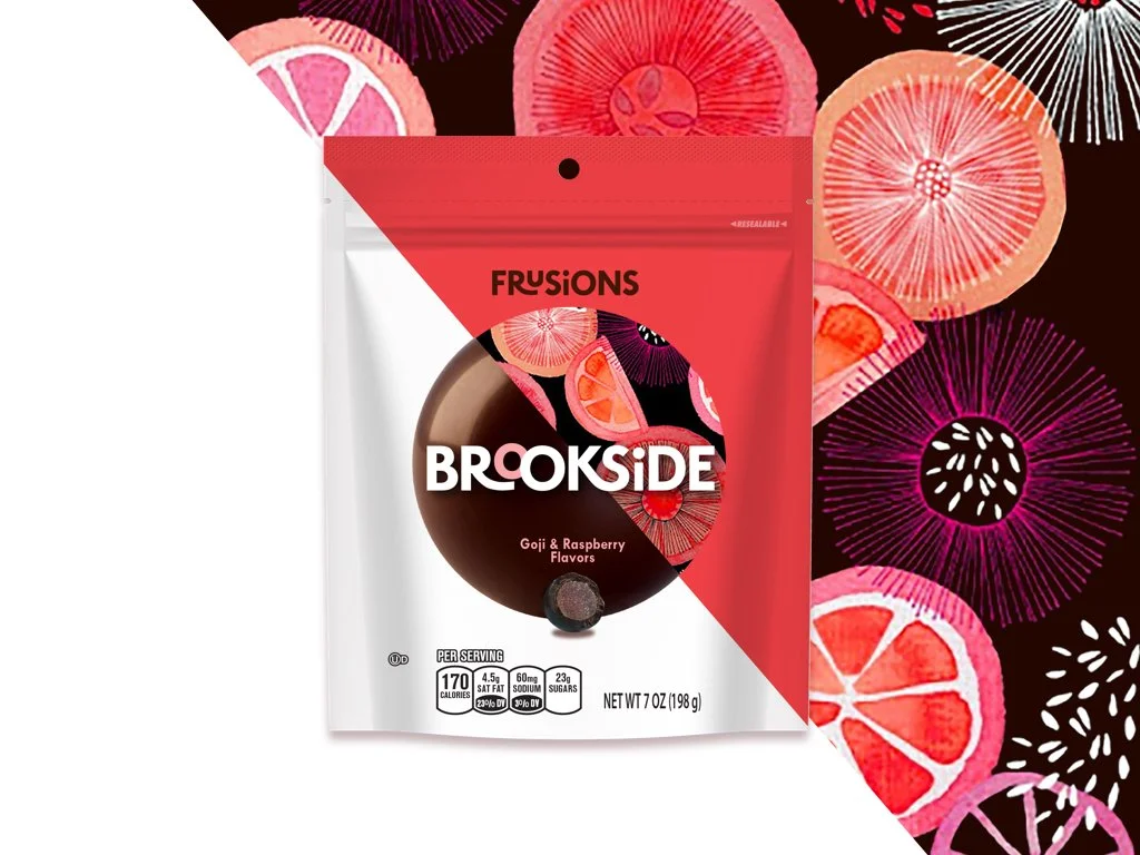
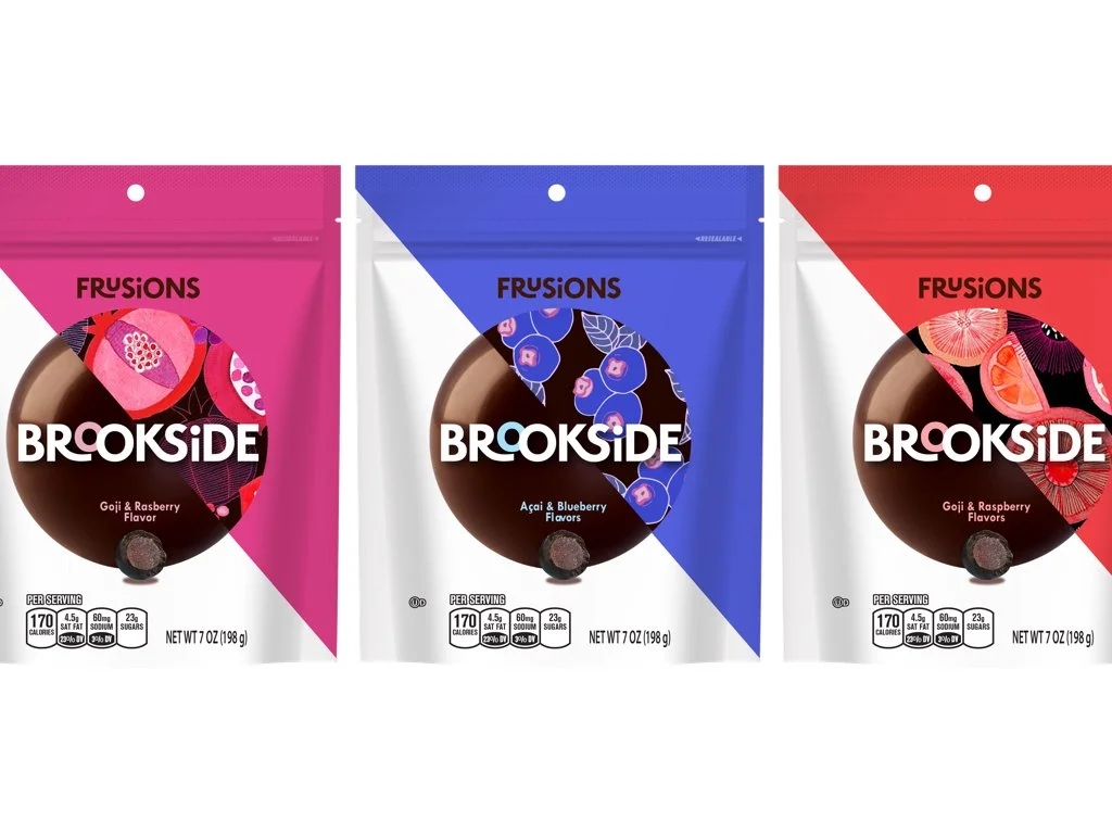
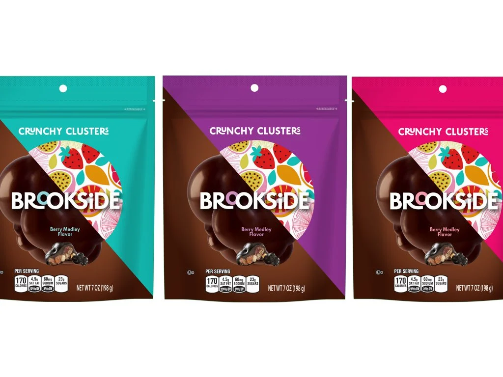
Delightful contrast, one expressive statement per pack.
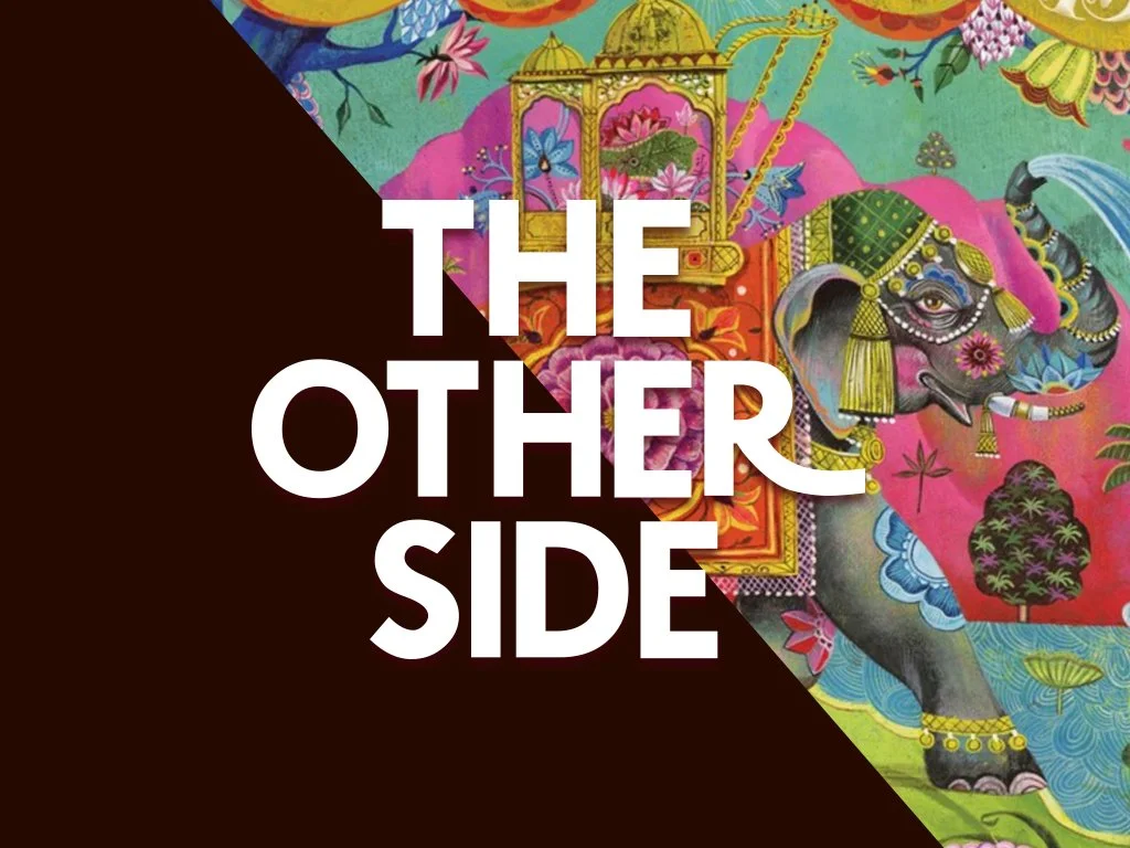
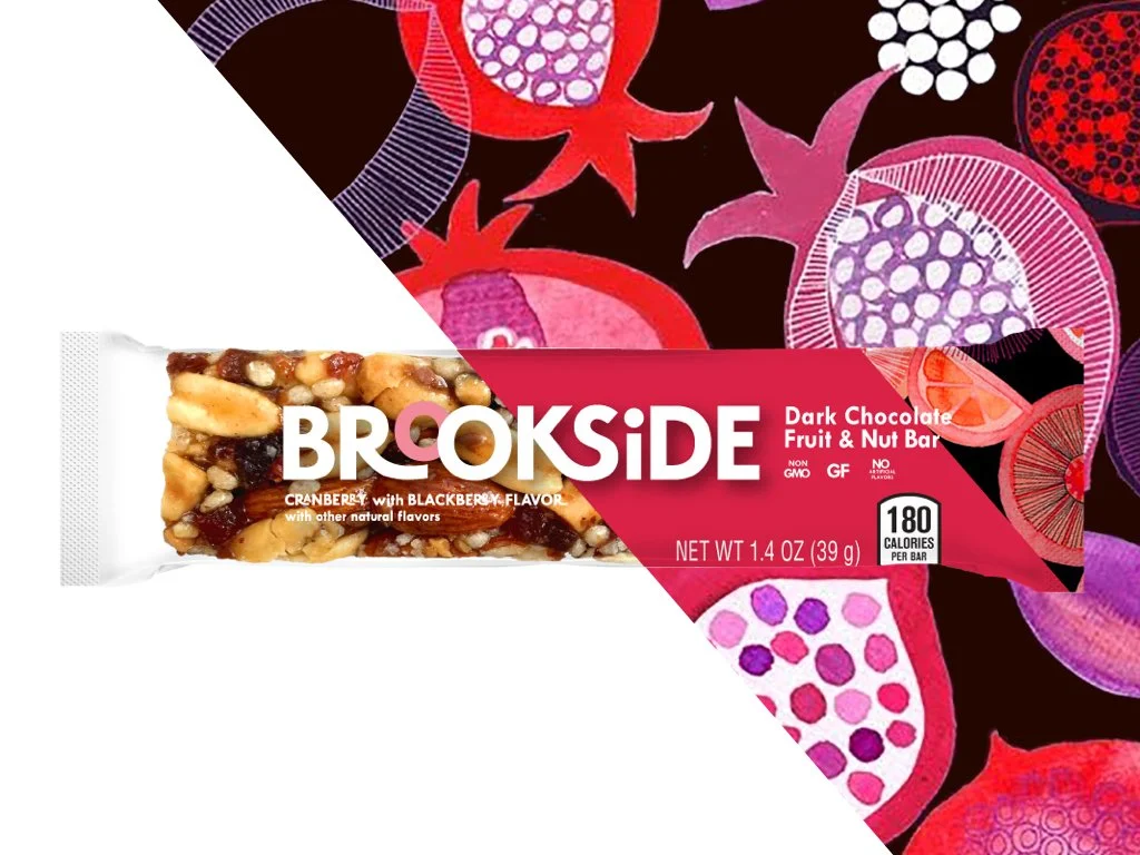
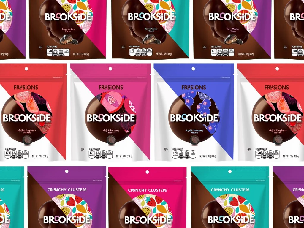
I drove the creative toward a split-pack system where contrast is the whole story. Bold, saturated color carries flavor on one side. Illustration and tactile cues carry origin on the other. Clustered pieces get lively, bubbly compositions. Informal, approachable. Covered fruit gems get clean, refined treatments. Precise, premium. Granola bars use transparency and color accents to join the family without repeating it.
Every choice favors clarity over clutter. The pack reads as a single idea: indulgent dark chocolate, balanced with bright, honest fruit.
Studio | goDutch - Cincinnati, OH
Creative Director | Andy Keene
Strategy Director | Tammy Anthony
Senior Designer | Lori Ravensbeck
Designer | Zach Janszen