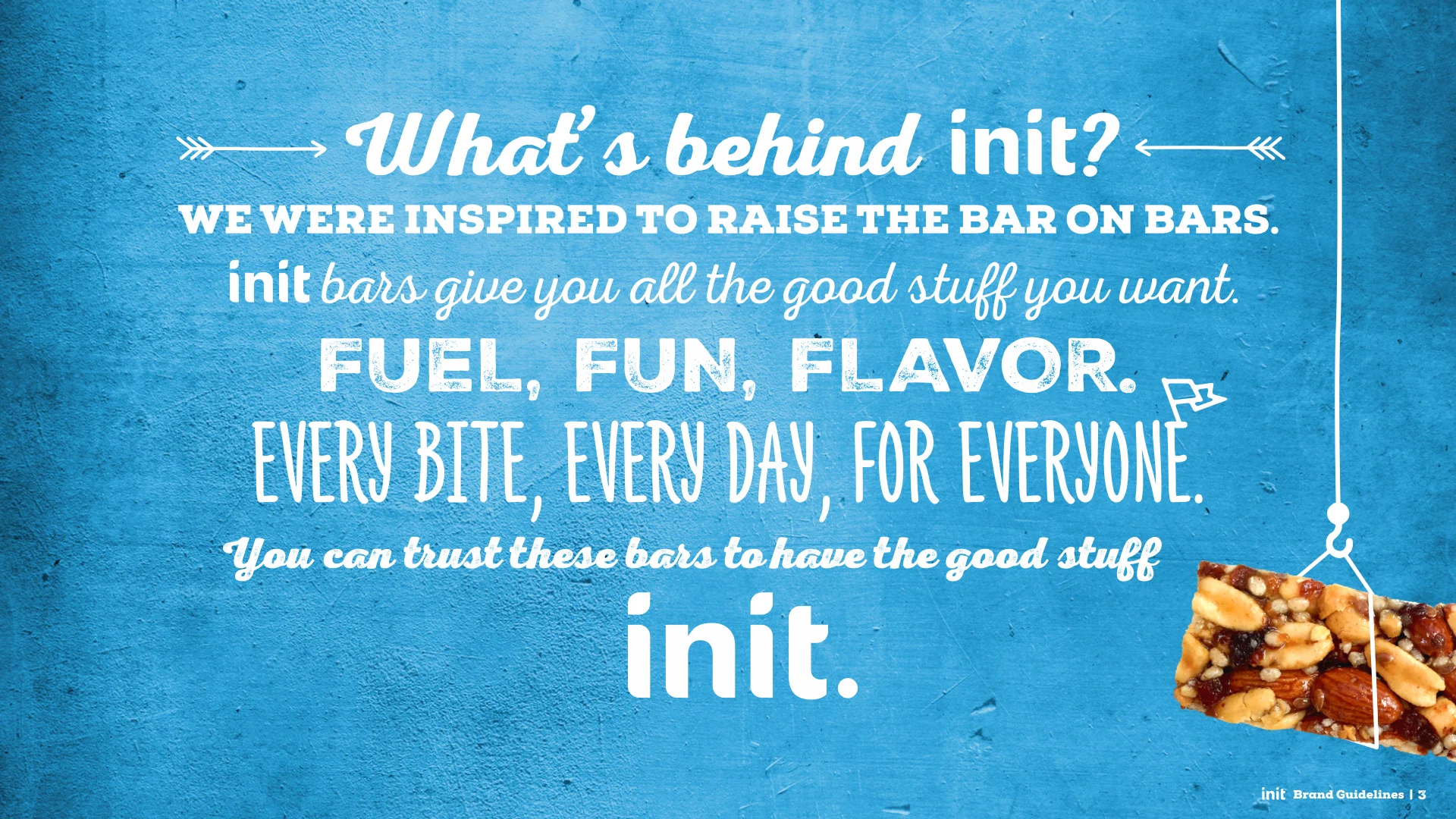
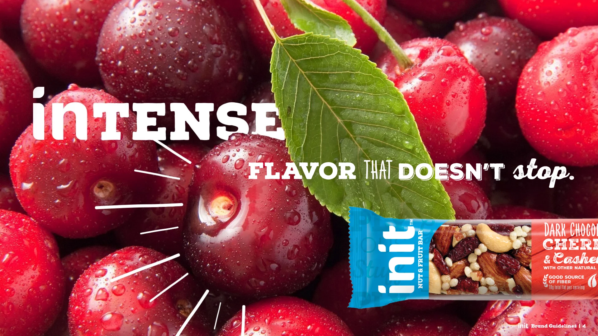
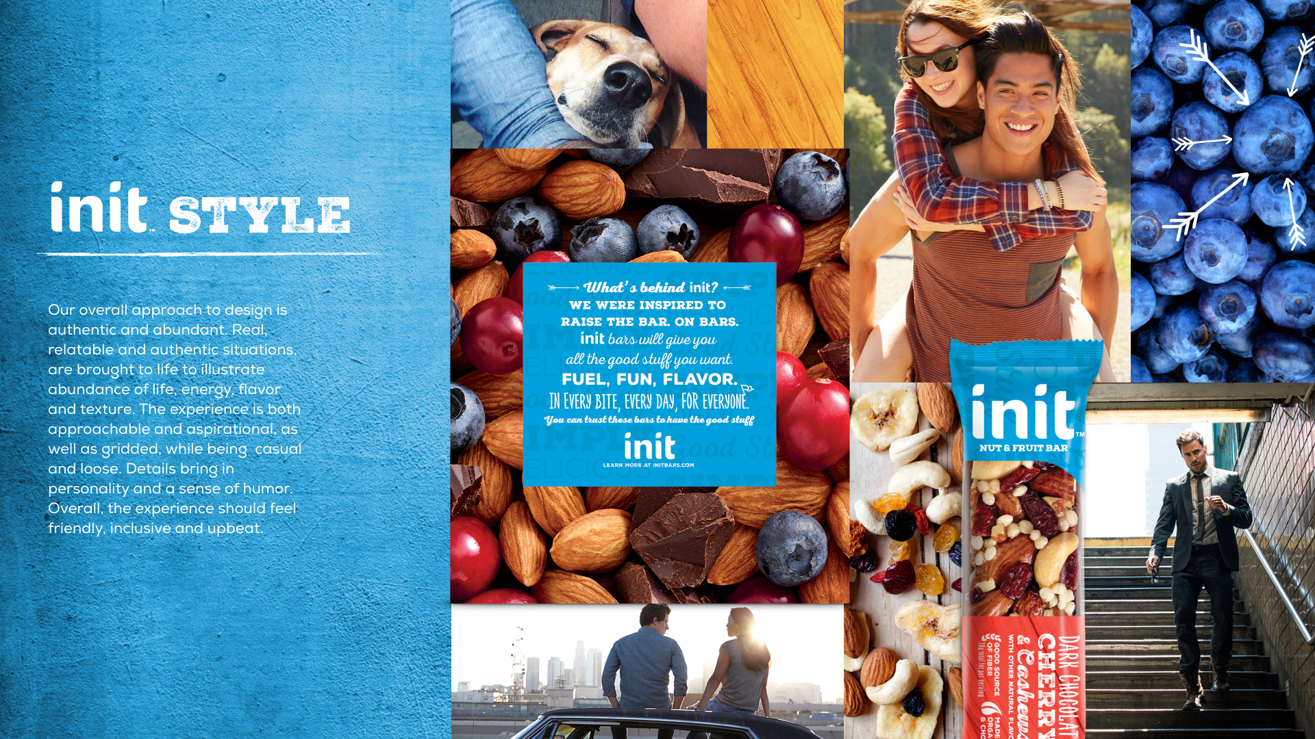
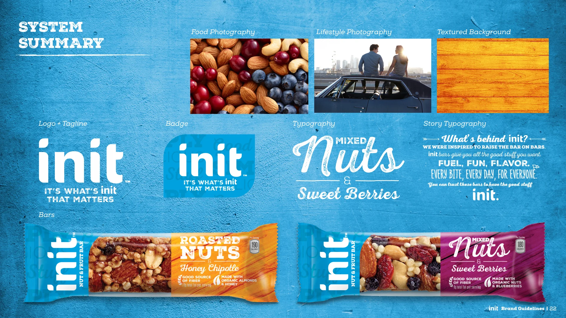
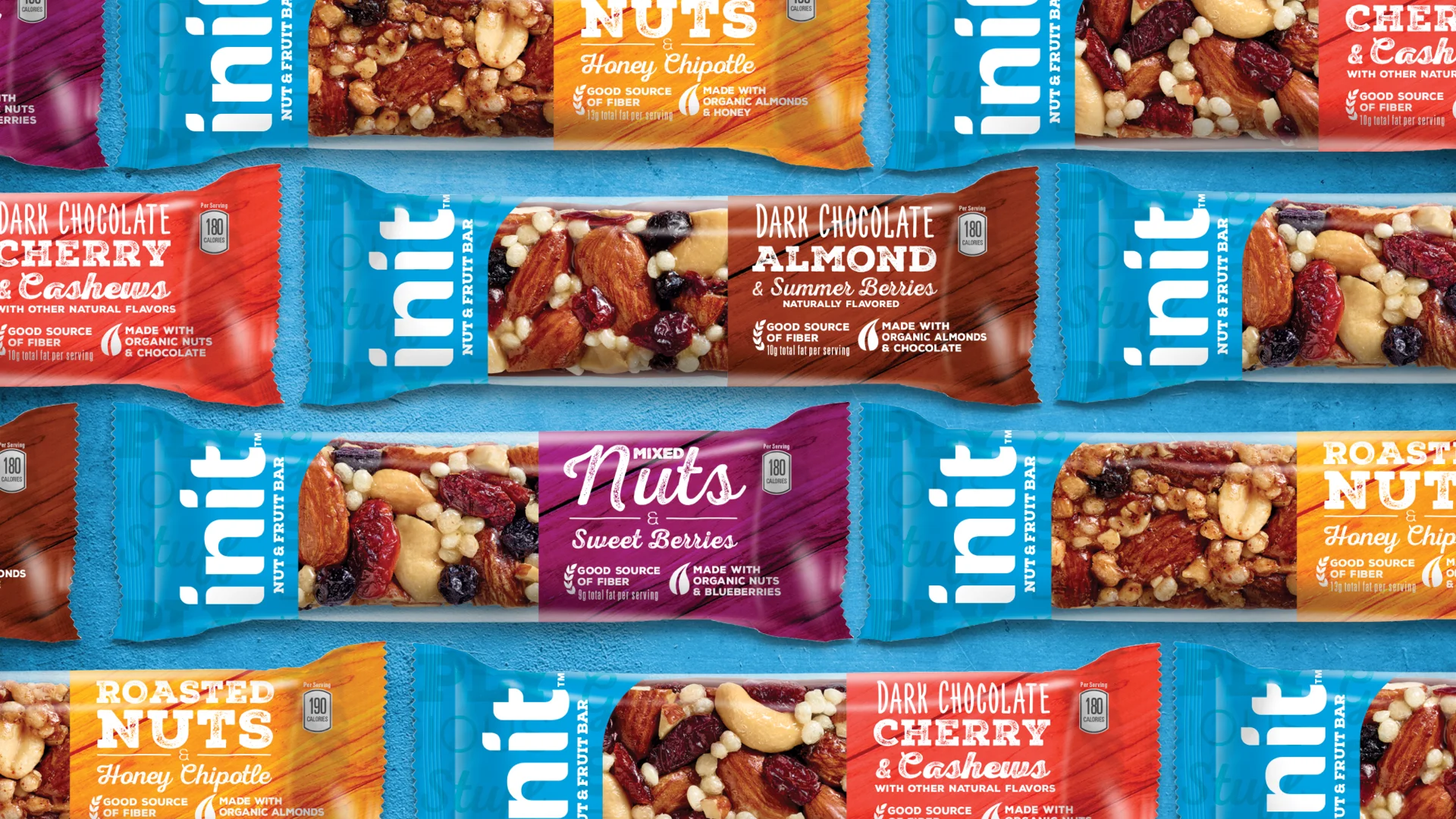
goDutch studio was approached to design a fruit and nut bar with a big personality. The team came up with bars that focus on big flavor with healthy natural ingredients, and with a more authentic, real, and friendly design. The brand experience is playful with unique typography and allows for multiple combinations. Small details like illustrations, and graphics bring a sense of personality and humor to each individual flavor. The brand experience overall should feel light, fresh, and playful.
Crest's portfolio of BE's products was expanding into more flavor cued offerings of mouthwash. Landor was tasked with creating a more experiential line of mouthwash. The BE system uses a unique set of icons within a large icon to depict a more millennial experience. This is an exploratory of how we could extend the current system and add to the already robust system of iconography.
___________________________
goDutch, Cincinnati


Previous
Previous
Wings
Next
Next